
The Silent Promise: Why Visual Feedback is Non-Negotiable in High-Energy, Low-Signal Environments
In the world of user experience (UX) design, the goal is always clarity. An interface should speak fluently to its user, guiding them seamlessly through tasks. But what happens when that ‘voice’ is completely drowned out? This is the central design dilemma faced by apps operating in high-energy, high-noise settings…the concert hall, the sports arena, and perhaps most acutely, the nightclub or party venue.
For ZillaBooth Party, an app designed to facilitate everything from queueing up a photo booth session to pre-ordering a drink from a busy bar, the environment itself is the primary antagonist to good UX. When the bass is vibrating through your body, the lights are strobing, and a hundred conversations are dissolving into white noise, the traditional pillars of app feedback…auditory cues, subtle visual changes, and even haptic vibrations…all but vanish. In this sensory overload zone, a simple tap on a button becomes an act of faith. The user taps ‘Confirm’ and is left with one anxious question: Did it work?
The answer to this profound design challenge lies in a dedicated visual solution: the Confirmation Animation. It is a carefully engineered, non-verbal declaration of success…an unmistakable, full-screen moment designed to cut through the chaos and instantly deliver peace of mind.
The Noise Floor: Why Traditional Cues Fail
To appreciate the necessity of a dedicated confirmation animation, we must first analyze the sensory landscape of a club or a high-volume party. This environment dictates a complete re-evaluation of standard UX best practices.1. Auditory Bankruptcy: In a quiet setting, a simple ‘ding’ or ‘chime’ is an elegant sign of success. In a club where sound levels routinely exceed 90 decibels, the application’s sound feedback is not just missed; it is literally impossible to hear. The user may be wearing earplugs, or the phone speaker may be covered by a hand or jacket pocket. Relying on sound in this environment is a failure of design from the start.
- Haptic Ambiguity: Many designers turn to vibration as a silent communicator. While effective in a pocket or on a table in a quiet room, a phone’s vibration is easily lost in a loud environment. The low-frequency bass waves already cause subtle vibrations in the user’s hand and clothing. The tiny, localized pulse of a phone’s motor gets drowned out by the broader, systemic vibration of the music. Furthermore, a simple vibration is binary: it only communicates something happened, not what happened. Was that a confirmation, or just a new text message? The ambiguity is high.
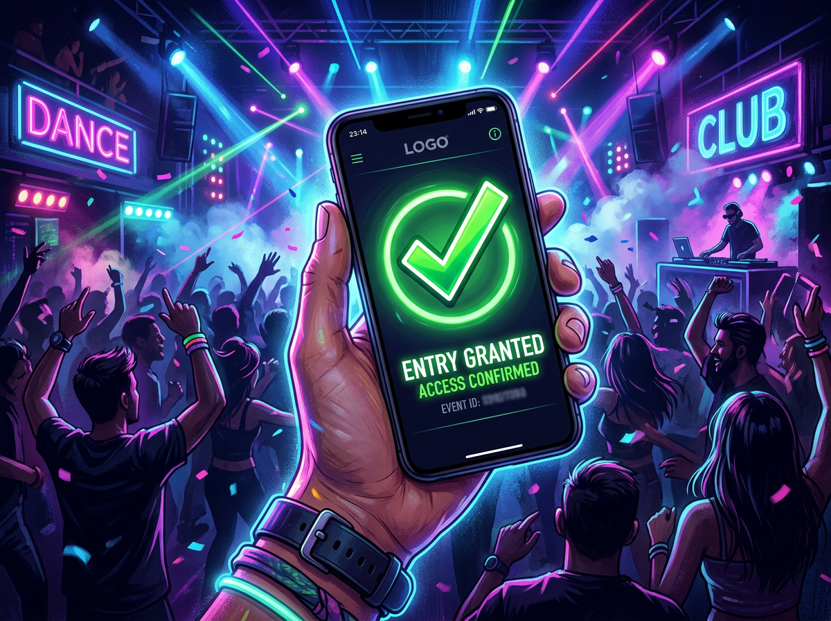
- Subtle Visuals Are Invisible: Standard web and app design often uses subtle cues for success: a button fading from blue to green, a small checkmark appearing next to a list item, or a toast notification sliding in from the bottom. In the low, uneven light of a club…where the phone screen itself is a primary light source…the user’s eye is already fatigued and distracted. A small, corner-of-the-screen notification is simply not visible or registered in the user’s peripheral vision. The design must be bold, central, and impossible to overlook.Engineering Peace of Mind: Principles of the Confirmation Animation
The ZillaBooth Party Confirmation Animation is thus not a mere embellishment; it is a critical functional element born from the necessity of its environment. It must adhere to a specific set of principles to be effective: * Maximum Contrast and Color Saturation: The animation must utilize colors that punch through a dark interface. This often means bright, high-value colors like electric green, radiant yellow, or pure white. Crucially, the animation should momentarily invert the color scheme, perhaps flashing from the app’s dark-mode background to a screen-filling burst of light, momentarily giving the user’s eyes an unmissable visual shock. This is the visual equivalent of shouting ‘YES!’
* Full-Screen or Dominant Screen Real Estate: The animation must occupy the vast majority of the screen, if not the entire screen, for its duration. This prevents the user’s attention from drifting to other UI elements or the distracting environment. A large, simple icon…like an oversized, dynamic checkmark or a stylized, expanding ‘Success’ ring…is more effective than detailed text, which may require focused reading.
* Purposeful, Unmistakable Motion: The movement itself must communicate finality. A quick, energetic motion that resolves into a static success state (e.g., a burst of particles that coalesces into a solid green checkmark) works better than a continuous loop or a subtle glow. The motion should clearly signal an event closure.
* Strategic Duration: The animation must be slow enough to be fully processed but fast enough not to feel like a delay. A sweet spot often falls between 800 and 1200 milliseconds. This short window is long enough for the user to lift their gaze from the button, register the full-screen visual event, and consciously acknowledge the action’s success, all while maintaining the flow of their social activity.
* Haptic Reinforcement (The Secondary Cue): While the visual is primary, the animation must be perfectly synchronized with a single, strong, unique haptic pulse. This pulse is not for primary communication, but for multi-sensory reinforcement. When the user sees the green flash and feels the strong, singular thud, the brain registers the confirmation with greater certainty.The Critical UX Benefit: Preventing Errors and Reducing Cognitive Load
The payoff for engineering such a dramatic visual is enormous, extending far beyond simple aesthetics. In a high-pressure environment like a busy nightclub, the Confirmation Animation directly addresses the two greatest causes of user error:1. The Double-Tap Problem: The single most common failure state in any low-feedback environment is the “double-tap” or “triple-tap.” A user taps ‘Order,’ sees no immediate change, assumes the app failed, and taps again. In the context of ZillaBooth Party, this could mean: * System Strain: The app is now processing two identical photo booth orders, taxing the system unnecessarily.
* Monetary Loss: The user is charged for two drinks or two photo strips when they only wanted one. The subsequent need for a refund or correction ruins the entire user experience.
The instantaneous, unambiguous visual confirmation eliminates the doubt that leads to the double-tap, saving the user money and preventing system errors.2. Anxiety and Trust Erosion: Uncertainty breeds anxiety. When a user spends money or queues up a shared resource (like a photo booth slot), they need immediate reassurance. Did my payment go through? Is my photo slot saved? A lack of confirmation forces the user to divert cognitive resources…checking their bank balance, asking a friend, or worrying…instead of enjoying the event. The Confirmation Animation is a moment of total psychological release. It says, “Success confirmed, go back to having fun.” This builds profound trust in the ZillaBooth brand, transforming a stressful interaction into a reliable utility.The ZillaBooth Scenario: A Walkthrough
Consider a user, Sarah, standing in a crowded bar area within the venue. She wants to use ZillaBooth Party to pre-order a round of drinks before joining her friends at the photo booth. * Action: Sarah quickly selects her items and taps the ‘Pay Now’ button.
* The Wait (The Hidden Danger): The app takes 500ms to communicate with the payment server. In a quiet room, a subtle loading spinner would suffice. Here, the spinner is tiny and ignored. Sarah’s finger hovers over the button. Doubt begins to set in.
* The Confirmation Animation Firework: Just as Sarah is about to tap the button again, the app receives success confirmation. Immediately, the entire screen goes momentarily white-hot, overlaid with a massive, stylized, emerald-green checkmark that dynamically draws itself out with a fast, satisfying swoop. A strong, synchronized haptic buzz is delivered.
* Outcome: Sarah registers the full-screen event instantly. The clarity is total. The feeling is not just success, but relief. She lowers her phone, confidently walks to the pickup point, and avoids a costly double-order.Conclusion
The design of the Confirmation Animation in ZillaBooth Party is a perfect illustration of how effective UX must adapt to its environment. It is a bold, almost aggressive design choice…a purposeful over-communication…that directly counters the sensory chaos of the club. By maximizing contrast, screen space, and motion, and by minimizing ambiguity, the animation transforms a high-risk transaction into a moment of pure, silent certainty. In the loudest, darkest, most chaotic settings, the Confirmation Animation is ZillaBooth Party’s silent promise to the user: Your action was successful. Go enjoy the party. It proves that in UX, sometimes the most crucial communications are the ones that are seen, not heard. This foundational design choice is what separates an app that merely functions from one that truly elevates the high-energy social experience.


