Your wedding day is a masterpiece of carefully selected details…the perfect floral arrangements, the tailored attire, the hand-calligraphed invitations. But in the age of instant sharing, one small detail often overlooked is the single most important piece of personalized content that your guests will take home: the photo booth picture.
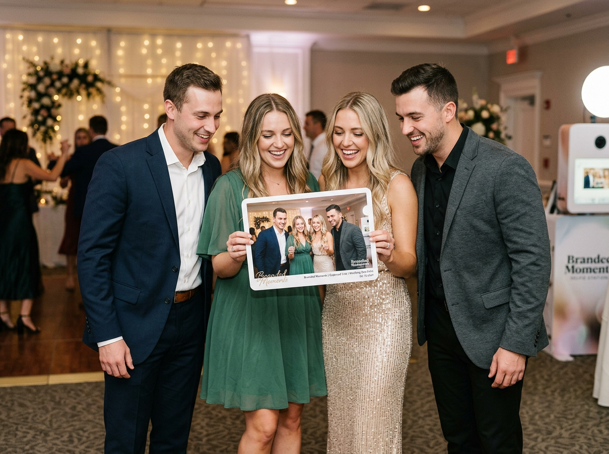
This is where the difference between a fun night and a truly branded event comes in. Moving past the generic photo booth strip, smart couples are now utilizing “Branded Graphic Overlays” to professionally customize every single image captured, transforming a simple souvenir into a cohesive piece of their wedding’s visual legacy. Think of it as your wedding’s watermark, designed by you, and instantly shared with the world.
This guide is your 101 course to mastering this pro-level wedding branding technique using ZillaBooth Party’s intuitive design system. We’ll cover what an overlay is, why it matters, how to design it, and, crucially, how to match your graphic overlay design to the most dominant wedding color trends of 2026…whether you’re embracing the muted calm of sage green, the rustic energy of terracotta, or the bold statement of “poppy red.”
The Power of the Branded Graphic Overlay
A branded graphic overlay is the custom-designed digital frame, border, or graphic element that is digitally added to every photo, GIF, or video taken in your ZillaBooth Party photo booth. It’s a tool that takes your wedding’s aesthetic…its font, color palette, and theme…and stamps it onto a high-quality, instantly shareable memory.
Why is this so critical? It elevates the photo booth experience from a simple prop to a legitimate extension of your event design.1. Visual Cohesion and Professionalism: An overlay featuring your custom monogram, wedding date, and signature font ensures that every shared image, whether printed or posted on Instagram, immediately feels like it belongs to your event. It eliminates the visual clutter of generic photo booth logos and introduces a professional polish that rivals editorial photography.
2. The Ultimate Personalized Favor: Guests love a physical souvenir. When that souvenir is perfectly designed and customized, it becomes a keepsake they’ll actually keep.
3. Amplified Social Sharing (The Hidden ROI): This is the digital-age superpower of the overlay. When guests immediately share their photos on social media, the branded overlay acts as a highly effective, organic marketing tool. Every share is a public declaration of your wedding’s brand, complete with your hashtag and date…a visual legacy that lives long after the last dance.
4. Tying Together Diverse Visuals: Guests will be taking photos against different backdrops…the main booth, perhaps a roaming booth, or even just candid shots. The overlay is the single element that ties these disparate images together, giving every picture a unified, cohesive look.Tutorial: Designing Your Pro-Level ZillaBooth Overlay
The ZillaBooth Party design platform is built for simplicity, but achieving a truly professional look requires strategic thought. Here is a step-by-step tutorial to craft a beautiful, impactful graphic overlay.
Step 1: Define Your Format and Orientation
Before designing, you must know what the design will frame. ZillaBooth offers several popular formats: * The Classic Strip (2×6 inches): This is a vertical orientation, often containing 3-4 small photos. The overlay space is highly restricted, usually limited to a small area at the top, bottom, or across the dividing lines. Pro Tip: Use a simple font and only your initials or date.
* The Print (4×6 or 5×7 inches): This provides the most real estate for design. You can opt for a full border, a corner flourish, or a banner across the bottom. This format allows for more detailed graphics and more text.
* The Digital/GIF: For digital-only formats, the aspect ratio is often a single 1:1 square. The overlay should be a thin, elegant border or corner design that doesn’t distract from the main subject.Step 2: Select Your Essential Elements
Keep it focused. A good overlay is minimal and intentional. Choose no more than three primary text elements: * The Couple’s Names (or Monogram): “Sarah & David,” “The Millers,” or an elegant initial monogram “S + D.”
* The Date: “October 20, 2026.”
* The Hashtag: This is mandatory for social sharing. Keep it brief and memorable, e.g., “#NewlywedMillers.”
* Optional Graphics: A subtle leaf motif, a simple line drawing of your venue, or a clean geometric shape. Rule of Thumb: If you wouldn’t put it on your wedding invitation, don’t put it on your overlay.Step 3: Master the ZillaBooth Design Tool
The ZillaBooth portal features a specialized overlay builder. * Start with a Template: Don’t reinvent the wheel. Browse the ‘Elegant,’ ‘Modern,’ or ‘Rustic’ template categories. A well-designed template gives you the perfect proportions and balanced layout right away.
* Input Your Text: Replace the placeholder text with your names, date, and hashtag.
* Import Your Font File: If you used a specific, signature font on your invitations, upload that file to the ZillaBooth system. Consistency across your paper suite and your digital suite is what defines professional branding.
* Color Matching: Use the eyedropper or HEX code tool to exactly match your main wedding color. This is the difference between “close enough” and “perfect.”Matching Your Overlay to 2026’s Hottest Wedding Color Trends
The 2026 wedding landscape is defined by three distinct and powerful palettes. A professionally branded overlay doesn’t just feature a color…it features the right tone of the right color, chosen to complement your overall vision.
Trend Focus 1: Sage Green Tranquility
Sage green has solidified its position as the new neutral. It’s subtle, organic, and incredibly versatile, evoking a sense of calm and natural sophistication. * Overlay Strategy: The goal is soft elegance. Avoid harsh, solid blocks of color.
* Design Application: Use a water-color wash effect in sage green for a delicate border. Alternatively, apply a thin, clean line in a darker, dusty cedar green along the edge of the photo for definition.
* Graphic Elements: Feature minimalist line-art of eucalyptus, ferns, or olive branches. The key is small, delicate graphics placed only in the corners, allowing the photo itself to remain the focus.
* Font Pairing: Pair the organic green with a classic, high-contrast serif font in a soft gray or off-white color for the text elements (names and date).Trend Focus 2: Terracotta Warmth
Terracotta, along with its related family of burnt oranges, rusts, and clay tones, brings a visceral, grounding warmth to events. It’s perfect for desert-inspired, bohemian, or autumnal weddings. * Overlay Strategy: Embrace texture and geometry. The look should feel rich and earthy.
* Design Application: Instead of a flat border, try a geometric pattern…semi-circles or angular blocks in varying shades of terracotta and cream. This gives the overlay a handcrafted, artisan feel.
* Graphic Elements: Look for abstract shapes or minimalist illustrations inspired by desert flowers, sun flares, or woven textures. Consider layering the terracotta with a deep ochre or a complementary deep navy blue for sophisticated contrast.
* Font Pairing: A relaxed, hand-written script or a bold, block-letter font works well here, particularly in a color like matte black or a dark bronze, which contrasts sharply against the warmth of the terracotta.Trend Focus 3: Poppy Red Power
Moving away from pastels, 2026 sees the return of bold, saturated color, and “poppy red” is leading the charge. It’s a statement of energy, romance, and confidence…not a shy accent. * Overlay Strategy: Less is more, but what is there must be impactful. Poppy red is best used as a dynamic accent rather than a background.
* Design Application: The most professional application is a single, razor-thin line in true poppy red framing the entire photo. This is a clean, modern statement.
* Graphic Elements: Use the red to highlight a single, stylized illustration…perhaps a graphic heart, a single dramatic rose, or the dot over a person’s ‘i’ in the custom text.
* Font Pairing: This bold color demands a crisp, modern pairing. Use a severe, non-decorative sans-serif font (in black or pure white) for the text, letting the vivid red provide all the drama.Advanced Branding: Taking Your Overlay to Pro-Level Cohesion
To truly brand your wedding like a pro, think about the design of the overlay not as a one-off task, but as a crucial piece of your overall visual identity.1. Inverse Contrast Coordination: If your main wedding palette uses dark text on light paper (a white invitation with black ink), try flipping the script for the overlay. Using light text on a deep, saturated color can give the overlay a high-tech, digital-first aesthetic that contrasts beautifully with your traditional paper goods.
2. Theme and Tone Consistency: If your wedding is black-tie and highly formal, ensure the overlay uses a calligraphic font and an elegant monogram. If your wedding is a beach elopement, the font should be more organic, and the graphic perhaps a small wave or shell. The overlay must reflect the tone of the event, not just the colors.
3. Test for Print and Digital: Always proof your final design by viewing a mock-up both on a screen (to check social media clarity) and as a physical print sample. A complex design that looks great on a 4×6 print might become cluttered and illegible on a 2×6 strip.Ultimately, the ZillaBooth Party branded graphic overlay is your last, best opportunity to professionally brand the most shared memories of your wedding day. By carefully selecting your format, keeping your elements clean, and strategically matching your design to the powerful color trends of 2026, you ensure that every photo shared carries the indelible mark of your stylish, cohesive, and unforgettable celebration. Don’t just take pictures…brand your moments.